
Font Families
A a
Hevetica Neue
A a
Helvetica
A a
Arial
Colors
Ink Navy
class: bc1 fc3
Carbon Gray
class: bc2 fc3
Porcelain
class: bc3 fc2
Emerald Teal
class: bc4 fc3
Indigo
class: bc5 fc3
Muted Gold
class: bc6 fc3
Cool Mist
class: bc7 fc1
Callouts
Standard Zurb Foundation Callouts
Note that we can change these base colors (primary, secondary, success, warning, and alert)
Basic
Primary
Secondary
Success
Warning
Alert
Background Color Callouts
bc1 fc3
bc2 fc3
bc3 fc2
bc4 fc3
bc5 fc3
bc6 fc3
bc7 fc1
Typography
H1 - Headline - 40px
H2 - Headline - 34px
H3 - Headline - 30px
H4 - Headline - 24px
H5 - Headline - 20px
H6 - Headline - 18px
DIV
P - Paragraph
B - Strong
I - Italics
Buttons
Accordion
- Drawer 1
Lorem ipsum dolor sit amet, consectetur adipiscing elit. Donec eget eros in augue malesuada pulvinar. Donec a turpis ornare, sodales ligula sed, fermentum arcu. Aliquam eleifend elit non leo laoreet vestibulum. Praesent egestas, metus eu rutrum consequat, erat orci consequat justo, ut fermentum metus tellus id quam. In placerat lectus diam, quis porttitor dolor commodo id. Maecenas mauris lacus, tincidunt ut enim ut, auctor pharetra eros. Morbi at pharetra nulla. Ut sed posuere dui, at porta metus. Fusce eget felis eros.
- Drawer 2
Nulla facilisi. Vestibulum quis efficitur est. Morbi sed neque urna. Nam consectetur augue a felis viverra, vel hendrerit massa convallis. Nunc scelerisque mattis ipsum. Maecenas cursus maximus ultricies. Nunc eget sagittis nulla. Maecenas mollis tempor condimentum. Nam id rhoncus odio, at posuere enim.
- Drawer 3
Integer imperdiet varius erat, a ullamcorper velit euismod in. Pellentesque velit elit, euismod eget egestas sed, fermentum lobortis justo. Aenean sed libero gravida, faucibus lectus ac, pharetra ligula. Nunc sit amet porttitor orci. Vestibulum ante ipsum primis in faucibus orci luctus et ultrices posuere cubilia curae; Fusce ac imperdiet ligula. Integer fermentum imperdiet diam in bibendum. Donec non nulla iaculis, convallis dui non, convallis est. Praesent est ante, aliquam eu lobortis vehicula, tempus et elit. Cras at urna justo. In mollis nisl ut enim dictum, ac mattis nisl commodo. Cras dignissim lorem nunc, id molestie turpis tincidunt vel. Pellentesque sit amet turpis ac sem elementum convallis. Donec in tincidunt elit.
Forms
Tables
| Name | Catalog # | Type | Species | Applications | Size | Price |
|---|---|---|---|---|---|---|
| GFP Expressing Human Brain Astrocytes | HMP201 | Primary Cells | Human | Cell Assays | 500,000 Cells - Frozen | $1,294.92 |
| Human Brain Astrocytes (HBA) | HMP202 | Primary Cells | Human | Cell Assays | 500,000+ cells - Frozen | $1,022.76 |
| Human Brain Astrocytes (HBA) | HMP202-T25 | Primary Cells | Human | Cell Assays | 500,000+ cells - T25 flask | $1,035.72 |
| Human iPSC - Astrocytes | IPS001 | Primary Cells | Human | Adherent Cell Assays, Cell Assays, Cell Culturing System | 500,000 Cells | $2,484.00 |
| Human iPSC - Astrocytes (Parkinson’s Disease) | IPS011 | Primary Cells | Human | Cell Assays | 1,000,000 Cells | $2,205.00 |
| Human iPSC - Astrocytes (PSEN2 mutant, N141I, HET) | IPS012 | Primary Cells | Human | Cell Assays | 1,000,000 Cells | $2,205.00 |
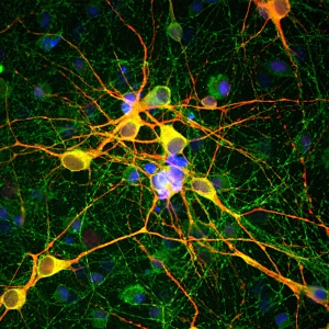
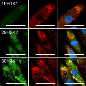
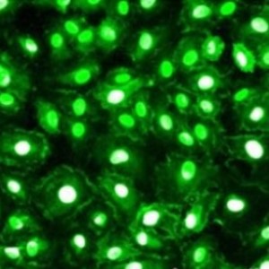
Images
Tabs
Tab A
Ut iaculis tellus ut enim ornare cursus. Aenean molestie accumsan semper. Duis felis ligula, suscipit in neque feugiat, interdum rutrum nulla. Duis aliquam ligula arcu. Vestibulum efficitur risus et ex blandit scelerisque. Nullam suscipit feugiat neque, quis ultricies neque aliquet maximus. Curabitur porttitor est id vestibulum finibus. Vivamus varius purus eget dolor vestibulum vestibulum.
Tab B
Ut iaculis tellus ut enim ornare cursus. Aenean molestie accumsan semper. Duis felis ligula, suscipit in neque feugiat, interdum rutrum nulla. Duis aliquam ligula arcu. Vestibulum efficitur risus et ex blandit scelerisque. Nullam suscipit feugiat neque, quis ultricies neque aliquet maximus. Curabitur porttitor est id vestibulum finibus. Vivamus varius purus eget dolor vestibulum vestibulum.
Tab C
Ut iaculis tellus ut enim ornare cursus. Aenean molestie accumsan semper. Duis felis ligula, suscipit in neque feugiat, interdum rutrum nulla. Duis aliquam ligula arcu. Vestibulum efficitur risus et ex blandit scelerisque. Nullam suscipit feugiat neque, quis ultricies neque aliquet maximus. Curabitur porttitor est id vestibulum finibus. Vivamus varius purus eget dolor vestibulum vestibulum.
Product Example
- Related Products
- Supporting Products
- Product Publications
Product Publications
If you've used this product in a publication, let us know. Email pshuster@neuromics.com with the publication details.
- Product Reviews